 Elliot Rylands
How I built a React accordion gallery
Entry 1 in a React tutorial series: integrate AccordionGallery with GSAP, wire props and motion, keep keyboard and reduced-motion honest, then add an expand control.
This is the first note in a React tutorial series I want to keep writing: small, shippable UI patterns with real dependencies, not slide decks about craft. Today we build and integrate AccordionGallery, a horizontal image accordion driven by GSAP. You will see the live specimen on this page, the props that matter, how motion and accessibility fit together, and the expand overlay I wrapped around it for notes.
I still care about the design-engineer habit of proving behaviour in the same stack that ships. A still cannot tell you if hover feels right, if arrow keys cycle cleanly, or if reduced motion still expands the panel. That mindset shows up here as a short checklist, not as the whole essay. The spine of this note is the component.
What AccordionGallery is
AccordionGallery (from React Bits, JS and CSS variant, GSAP under the hood) lays image panels in a row. One panel stays expanded. Collapsed panels desaturate and tilt a little; the active panel goes full colour and flat, with its label visible. Hover or focus expands a panel; arrow keys move between them; click and tap work when hover is the wrong trigger. On narrow screens the row stacks. If the user prefers reduced motion, GSAP durations collapse to zero while the layout change still happens.
On this site I fed it five Pexels stills (Mountains, River, Workshop, Architecture, Ocean), set expandRatio to 0.52, and retuned accent, overlay, and text colours to warm orange on near-black paper instead of the default purple night. Try it below. Open larger view (or activate the already-open panel again) for a near-fullscreen lightbox; Esc or the backdrop closes it.


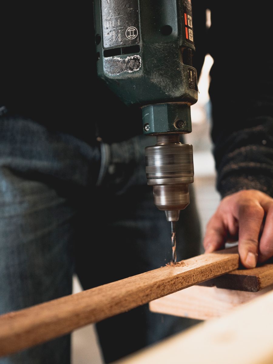
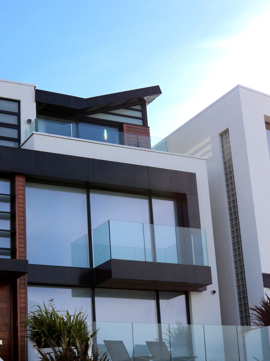

Hover or focus a panel. Arrow keys move between panels. Use Open larger view (or click the already-active panel) for a near-fullscreen lightbox. Esc or the backdrop closes it. Reduced motion skips the GSAP timing. Photos via Pexels.
How I integrated it
React Bits ships AccordionGallery as copy-paste source plus a GSAP dependency. In this Next.js App Router site the steps were: install gsap, drop the component into a kebab-case folder under the notes components tree, type the props surface in TypeScript, import the CSS beside the module, and render from a client component. The gallery uses ResizeObserver, matchMedia, and timeline cleanup on unmount, so it belongs behind "use client".
npm install gsapI keep a thin demo wrapper around the gallery for notes: the item list, site tokens, and the expand overlay live in accordion-gallery-demo.tsx; the motion and panel logic stay in accordion-gallery.tsx. That split makes the tutorial readable without turning the core component into a page-specific widget.
Props that actually matter
When I prototype with this component I touch a short list first: items (image, label, optional link and alt), defaultIndex, trigger ("hover" or "click"), expandRatio, height, gap, radius, grayscale, duration, ease, parallax, tilt, and the three colour knobs (accentColor, overlayColor, textColor). Orientation exists for a vertical stack; in a note column I keep horizontal and let the CSS media query stack on small screens.
<AccordionGallery
  items={items}
  defaultIndex={2}
  expandRatio={0.52}
  trigger="hover"
  accentColor="#e16a3a"
  overlayColor="#0a0a0a"
  textColor="#f5f3ed"
/>
Installing is npm and a folder. Integrating is choosing images that belong to the story, matching tokens so the specimen does not look foreign, deciding whether links should navigate or only expand, and proving the contract at a real device width. The demo above is that second step finished for this site.
Motion with GSAP
On active change the component builds a GSAP timeline: flex-grow (or height in vertical mode) for the expand, a short parallax drift on the media, a tilt unwind on the active panel, and a staggered fade-in for the caption bar and label. Duration and ease are props; defaults sit around 0.6s with power3.out. First paint skips the flourish so the page does not animate in from a collapsed mess.
Two practical notes from wiring it here: kill and recreate the timeline on each active change so overlaps do not stack, and clean up on unmount. ResizeObserver recalculates media size when the row width changes, which keeps parallax from fighting a stale layout after a breakpoint flip.
Keyboard and reduced motion
Panels are focusable. Arrow keys cycle the active index without trapping focus elsewhere. Enter or Space on the already-active panel can fire onActiveActivate (I use that for the lightbox). Each panel gets an accessible name from label or alt, and the expanded panel is marked with aria-current. That is the minimum I will ship before I argue about easing.
For prefers-reduced-motion the gallery reads matchMedia and sets effective duration to zero. The expand still happens (layout is the point); the choreography does not. When you review your own build, tab to a panel, use the arrows, then toggle reduced motion in the OS and confirm the panel still opens without the tween.
The expand control
A note column is a tight home for a five-panel accordion. I added a demo chrome with an Open larger view button and a portal lightbox that remounts the same AccordionGallery at a viewport-aware height. Clicking the already-active panel (or pressing Enter or Space on it) opens the same overlay via onActiveActivate. Esc, the close button, or a backdrop click dismisses it and returns focus to the expand control.
That wrapper is not part of React Bits. It is the integration layer: same props, same motion, a larger stage so people can feel the accordion instead of squinting at a thumbnail.
What to try next
Swap trigger to "click" and compare on a phone. Point images at your own CDN with known dimensions. Flip grayscale off and retune accentColor to your brand. Profile flex-grow plus parallax if this sits above the fold on a long page. Add an axe (or equivalent) check so focus rings and names do not regress when someone restyles the caption bar.
If you want a complementary bench for a single control, Button Autopsy at /lab/autopsy is where I dissect button states and hierarchy. Next in this React series I will pick another production-shaped pattern and walk the same loop: integrate, tune, prove input and motion, then leave you something you can fork.
Want a complementary learning bench for a single control? Button Autopsy is where I dissect states, hierarchy, and craft on a button.
Open Button Autopsy