Decoding Data: How UX/UI designers are making the user the hero of the story
Jun 13, 2023

In the vibrant realm of UX/UI design, there's a bit of a superpower that's often overlooked. It's called 'data'. Rather unassuming at first glance, data, when used appropriately, can transform a humdrum interface into a heart-throbbing, engaging, user-centered wonderland.
Why is this? Well, it's simple. Data paints a vivid portrait of your users, their needs, and their behaviors. It provides tangible, empirical evidence to inform design decisions, reducing guesswork and the risk of launching a product that is about as useful as a chocolate teapot.
Understanding the users – their needs, their preferences, their frustrations – is not just important; it's the sine qua non of successful product design. The "User-Centered Design" approach places the user at the heart of the design process, much like the fabled hero of a grand epic, around whom the plot intricately revolves.
But how do we get to know our users? How do we tap into their psyche, dissect their needs, and ultimately create a product that will have them singing our praises from the rooftops? Enter the holy trinity of data gathering tools - surveys, user testing, and analytics.
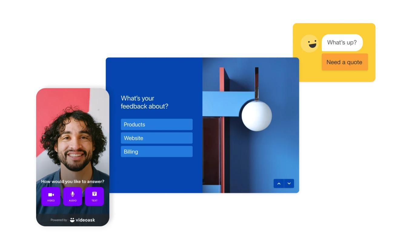
Take Typeform, for instance, the suave James Bond of survey tools. With its interactive interface, Typeform transforms the mundane task of survey completion into a delightful experience. It allows designers to gather in-depth qualitative data, insights directly from users' minds, and opinions as varied as the colors in a Wes Anderson movie. From questions about a user's favorite features to probing their frustrations, Typeform facilitates a deep understanding of users, making it the Sherlock Holmes of data collection.
Meanwhile, the interactive platform Usertesting.com has been causing quite the stir, and for good reason. Usertesting.com lets you watch and listen to users as they interact with your design. You can almost see the lightbulb moments, the furrowed brows of confusion, the smiles of satisfaction. It's like being a fly on the wall in your users' living rooms, minus the danger of being swatted away. This kind of insightful qualitative data is invaluable, painting a detailed picture of the user experience in real-time.
But let's not forget our quantitative pals. Tools such as Google Analytics provide a vast trove of user data, telling us about user demographics, behaviors, and interaction patterns. It's a bit like The Matrix - streams of numbers and figures that reveal the underlying truth of our digital world.
By combining these tools, UX/UI and product designers can gather a mix of quantitative and qualitative data, the Yin and Yang of user understanding. They provide a foundation for evidence-based design decisions and pave the way for innovative solutions that are inherently user-centric.
So, fellow designers, it's time to wield the power of data, listen to our users, and create designs that are not only pleasing to the eyes but also to the hearts of those who matter most - the users. After all, in the immortal words of one Steve Jobs, "Design is not just what it looks like and feels like. Design is how it works." And the key to making it work? You guessed it - data.
Design may be art, but it's an art that thrives on science. So, here's to making our designs not just beautiful, but beautifully effective!

Intro Video